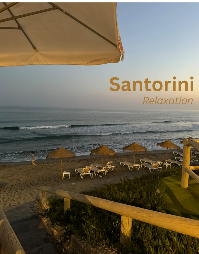
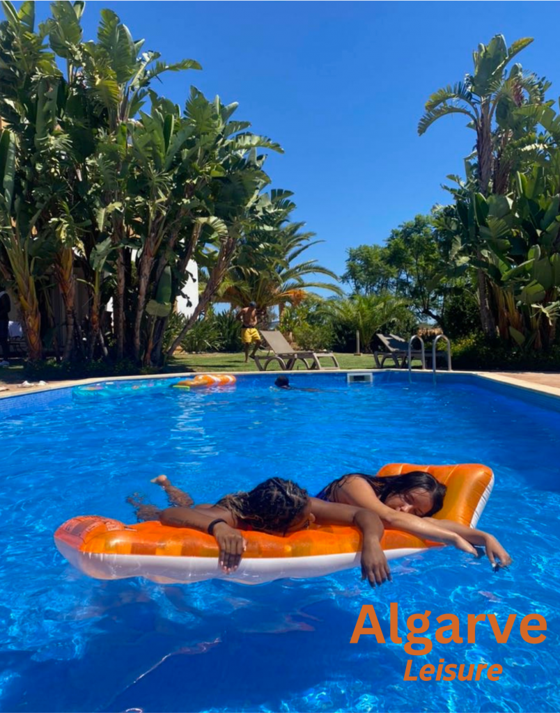
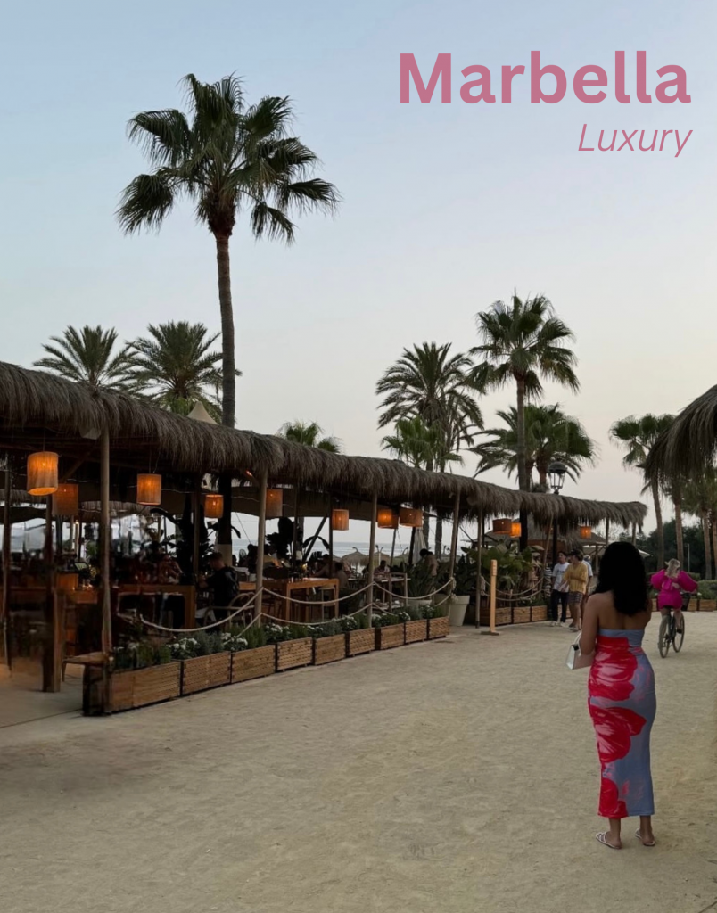
These posters effectively adheres to the given creative brief by ensuring a unified message, consistent color palette, and cohesive typography while allowing for subtle distinctions between each destination. The overarching theme of luxury, relaxation, and leisure ties all three posters together, reinforced by the subheadings that describe the experience each location offers. The colour palette is carefully curated to maintain consistency while reflecting the essence of each place – soft pinks for Marbella to evoke elegance, golden earthy tones for Santorini to enhance tranquility, and vibrant blues and oranges for Algarve to emphasise a fun, carefree atmosphere. The typography follows a structured approach, with bold sans-serif fonts for location names to create strong brand identity and italicized subheadings to add sophistication and flow. This balance ensures that the campaign remains visually cohesive while adapting to each location’s unique mood. The imagery also plays a key role in unification, as all three posters depict beachside or poolside leisure, reinforcing the aspirational aspect of travel. While perspectives and framing differ slightly, they all align with the overarching theme, ensuring the collection feels like part of a single, well-integrated campaign.
Leave a Reply